Convincing evidence of likely manipulation of 2024 Presidential votes in Nevada
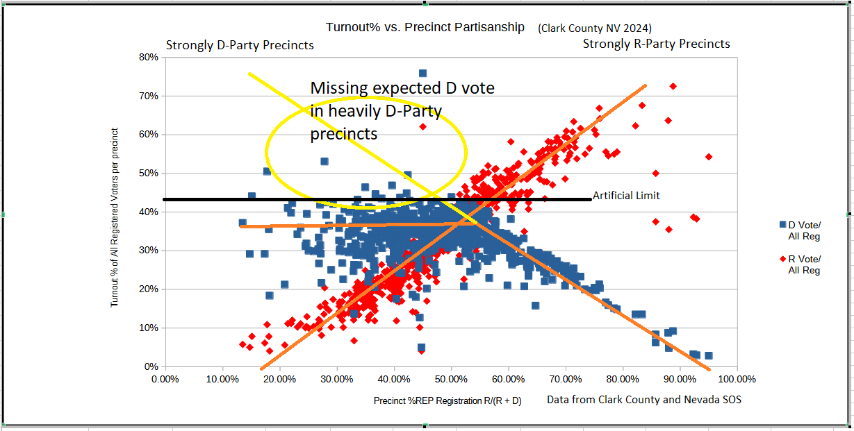
It seems that D-Party votes were artificially limited to 45% turnout.

We’ve been playing around with data from the state of Nevada in an effort to find any strong evidence that the data looks fishy. To refresh your memory, in Nevada, we had fairly anomalous results, since the state went to the D-Party candidate over Trump in 2016 and 2020. And all of a sudden, in this election, it is flipped, with Trump winning the state.
In addition, we noted that the Senate seat was won by the D-party candidate over the R-party, in “Partisan Dropoff.” If the D-party Senate candidate won, how can the D-party presidential candidate lose? (See https://substack.com/home/post/p-152243533)
The Cast-Vote Record (CVR) for the 2024 election provides anonymized, ballot-level voting data. By analyzing this data, I grouped votes by precinct to identify patterns in candidate support. The votes were grouped by precinct and summed to provide the total votes for each candidate in each precinct. Next, I got the total registration for each precinct, and I joined these tables on the precinct number.
We can rate each precinct on its partisanship by simply considering those voters affiliated with either the R or D parties. They range from about 10% to 90% for either party, depending on the location of the precinct. And those that are at the extremes may be in very small precincts. Thus, at the extreme right and left side of the plot, these data points are a bit erratic, so those can be ignored. All precincts with valid vote counts were included.
(View interactive chart with data points scaled to the number of voters. See Note!1)
The plot visualizes 750 precincts. Each precinct is placed horizontally based on its registration partisanship, considering only R-party and D-party voters.
Each precinct will have two data points, one red and one blue for the actual turnout in percent (votes for the candidate / All Registered voters in that precinct).
The horizontal axis represents the partisanship of each precinct, measured by the proportion of registered R-party and D-party voters. The vertical axis shows the turnout percentage for each party's candidate in that precinct.
What we should see is a big X where each party’s vote would have a roughly linear relationship. The precincts at the left side of the chart are strongly D-Party precincts while those at the right are R-party precincts. This logical visualization provides a clear depiction of partisanship trends.
D-Party vote artificially limited to less than 45%
What is absolutely stunning about this plot is the fact that in strong D-party precincts, turnout percentages consistently plateau below 45%, suggesting a systematic irregularity.
It seems there is an artificial limit to the turnout % allowed in those precincts, to less than 45%. The limit is so stark, it is chilling.
The data you see here is only for Clark County, which is a huge part of Nevada (around 66% of the state), and strongly D-leaning. Harris did win in this county. But her win here was not enough to offset the other third of the votes in the state, given this artificial limit.
In strongly partisan precincts, turnout percentages for the dominant party typically align closely with the party's registration percentage. Significant deviations, like those observed here, warrant further investigation.
For the sake of clarity, let’s take an example.
Precinct number: 4036; Total Registered Voters in this precinct = 2,439
Registration Split (among R & D Parties only): REP: 30% DEM: 70%
Vote counts: Trump:
399 Harris: 914
Vote shares: Trump: 31% Harris: 69%
Vote share of all registered voters: Trump: 16%; Harris: 37%
Voters compared with Party affiliated: Trump: 135%; Harris: 85%
Observation:
Expected Harris vote share (70%): ~1,707
Actual Harris vote share: 914 votes (only 85% of D-party voters).
Yes, we need to keep in mind that there are quite a number of non R&D voters. Of the 2,439 total registered voters in the precinct, 937 are non partisan and 141 are third-party affiliated.
We would have expected about 70% of the precinct to vote for Harris, or about 1,707 at the high end.
Where did the votes go?
The votes did not go to Trump. If that were the case, then the red curve would not be straight and continuous in that area, but be brought up and flattened. This indicates that the votes were lost before they were counted.
We already checked the voter history information, and the number of voters in each category was consistent. Thus, the voters who signed in at the polling locations, which were strongly tilted toward R-party voters, was consistent. Those who voted by mail were very strongly tilted toward D-party voters, and it was consistent as well.
Let’s consider each possibility in turn:
R-party votes added at in-person voting locations
NOT A MATCH: If this were the case, then the R-party (red) distribution would be tilted up, and it would not affect the blue distribution. So this does not match the data.
D-party votes deleted at in-person voting locations
MATCH: This does match the data, and it also would explain the large increase in R-party votes as compared with the total cast at the EV and ED polling places. Vote by mail voting was dominated by D-party voters, so that is less likely to be a place where D-Party votes could be deleted.
D-party votes deleted in mail ballots
MATCH: We now believe this is the most likely scenario. Please see subsequent posts where the data is further explored.
Conclusion
This method of analysis shows promise to diagnose election results quickly and before all other audits and investigations are completed.
To confirm these findings, additional analyses could include examining individual voter histories, reviewing ballot chain-of-custody records, and comparing mail-in vs. in-person turnout trends.
Please let me know if you live in Clark County and would be able to help look at some voting data.
Next Post: Election Scams
Previous Post: Inconclusive Evidence of Malfeasance in NV 2024 Election
All Posts: https://substack.com/@raylutz/posts
You may note that the data points in the leading chart in this post and those in the interactive plot are slightly different, and I have to apologize for this inconsistency. When I first developed this method, I was using a spreadsheet, and in an auto-save operation, only the csv version was saved. Thus, I lost my formulas and subsequent sheets. After an adrenaline rush and taking a break, I went back and reconstructed the analysis, this time using a Jupyter Notebook using Python and plotly, so I could create the interactive chart. I must have had some mistakes in my first version but the data still exhibits the same general form.
#VerifytheVote, Nathan and the Election Truth Alliance are lawyering up on behalf of disenfranchised Kamala voters. Data is evidence. Please visit their website, look at the data and donate to their gofundme if you can. If we collect $1 dollar from every Kamala voter we’ll have $80+M to fight for the truth. The crooks fundraise for legal costs all the time. Data strongly suggests ‘elections are secure” is an ongoing disinformation campaign. We can’t take their word for it any more. The government needs to prove it.
Why are we seeing all these voting irregularities in swing states AFTER FOTUS has taken the office? This should have been contested on November 6th.